Responsive Design Revolution: Elevating Websites for Mobile-First Experiences
.png)
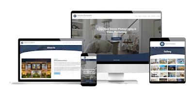
The Rise of Mobile Usage
With the proliferation of mobile devices, users are increasingly turning to their smartphones and tablets to browse the web, shop online, and interact with businesses. In fact, mobile internet usage has surpassed desktop usage, making it essential for businesses to prioritize mobile-friendly experiences. A responsive design ensures that websites look and function flawlessly on devices of all sizes, providing users with a consistent and intuitive experience regardless of the device they're using.
Enhanced User Experience
Responsive design isn't just about making websites look good on mobile devices; it's about delivering an optimal user experience. A responsive website adjusts its layout, content, and functionality based on the screen size and orientation, ensuring that users can easily navigate and interact with the site. Whether it's reading content, filling out forms, or making purchases, responsive design enables seamless interactions that keep users engaged and satisfied.
Improved Accessibility and Reach
In addition to enhancing the user experience, responsive design also improves accessibility and reach. By ensuring that websites are accessible on all devices, businesses can reach a broader audience and accommodate users with varying preferences and needs. Moreover, responsive design contributes to better search engine visibility, as search engines like Google prioritize mobile-friendly websites in their rankings. This not only improves organic traffic but also boosts overall online visibility and exposure.
EzSites4U's Approach to Responsive Design
At EzSites4U, we're committed to staying at the forefront of responsive design trends and technologies. Our team of expert designers and developers employs cutting-edge techniques to create websites that adapt seamlessly to any screen size or device. From flexible layouts and fluid grids to media queries and responsive images, we utilize a variety of tools and methodologies to ensure optimal performance and usability across all platforms.
Furthermore, we conduct rigorous testing and optimization to fine-tune the responsive design of each website, ensuring that it meets the highest standards of functionality and aesthetics. Our goal is to empower businesses to deliver exceptional mobile-first experiences that captivate users and drive results.
Conclusion
In today's mobile-centric world, responsive design is no longer optional—it's essential. By prioritizing responsive design, businesses can enhance user experiences, improve accessibility, and reach a broader audience. At EzSites4U, we're dedicated to helping our clients harness the power of responsive design to create websites that shine on every device. Contact us today to learn more about our responsive design services and take your website to the next level.

Comments
Post a Comment